You are using an out of date browser. It may not display this or other websites correctly.
You should upgrade or use an alternative browser.
You should upgrade or use an alternative browser.
Fury billboard
- Thread starter sauterd
- Start date
Thanks! Very cool!
Carmine
Old Man with a Hat
Is that something you made in photoshop, or something found on the interweb?
Does not look like an authentic advertisement.
Does not look like an authentic advertisement.
- Joined
- Nov 14, 2010
- Messages
- 27,947
- Reaction score
- 26,890
And yet I believe I’ve seen it before on this site. That’s my favorite Fury right there btw and I think my commentary was the same the first time around.

Both look legit.
Carmine
Old Man with a Hat
Sorry. No way.
"Continental elegance" was never any kind of Plymouth slogan. Certainly not in '68, when the very successful "beat goes on" slogan was being used.
Professional ad campaigns almost never elude to the mention of other makes. "Continental elegance" is essentially a free ad for Lincoln!
There are also no logos. No "Chrysler Corporation". The spacing is amateur. Photography was being used by '68, not sketches. The style is 1940s, not late 60s.
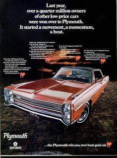
This is a real ad for a 1968 Fury. A billboard ad would have looked similar.
commando1
Old Man with a Hat
There are also no logos. No "Chrysler Corporation". The spacing is amateur. Photography was being used by '68, not sketches.
- Joined
- Nov 14, 2010
- Messages
- 27,947
- Reaction score
- 26,890
Could be a regional thing? In other words done by a local dealer or regional dealer association. If you look closely at the first one you can see joints in the billboard which if photoshopped wouldn’t be there? Background on it also appears era correct?
commando1
Old Man with a Hat
I'm looking at the background of the picture on the billboard in the first pic.
The gas price in the pic is 0.33 .
And that was the price of Regular in 1968.
The gas price in the pic is 0.33 .
And that was the price of Regular in 1968.
live4theking
Old Man with a Hat
- Joined
- Nov 24, 2014
- Messages
- 12,425
- Reaction score
- 8,476
Cool pics.
Stan it was still less than a dollar in the early 90's. It's just been the last few years that the price has gotten out of control. I know our European friends will tell us to stop crying about it.I'm looking at the background of the picture on the billboard in the first pic.
The gas price in the pic is 0.33 .
And that was the price of Regular in 1968.
jct
Senior Member
It was 87 cents back in the 90's
Carmine
Old Man with a Hat
Could be a regional thing? In other words done by a local dealer or regional dealer association. If you look closely at the first one you can see joints in the billboard which if photoshopped wouldn’t be there? Background on it also appears era correct?
Believe it or not, I thought of the regional angle. But where is the "see your greater Des Moines Plymouth dealer" tag? If dealers are spending money, they're damn sure gonna put their name on it. (see attachment)
Dealers might uses something as awkward as "Continental elegance", but at least a copywriter would get the capitalization correct. "half the price"? Again, not very professional.
It reminds me of a model train display or those tin musclecar signs...
Very nice; even has logos, but we know tin signs went out with gas pump globes.
Last edited:
Carmine
Old Man with a Hat
...and finally, just the uneven spacing. No pro would letter right to the edge of a billboard. Spacing around the lettering would be uniform. When did you ever see a Mopar illustration that sunk the tire up into the fenders like a low-rider? Unless the creator needed to more room for text.. Photoshop to the rescue.
Sorry, it's just that I hate fakes passed off as real history. You guys have to get good at it or you'll start believing Time magazine covers.
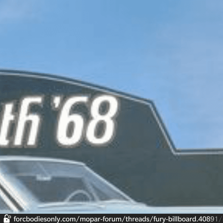
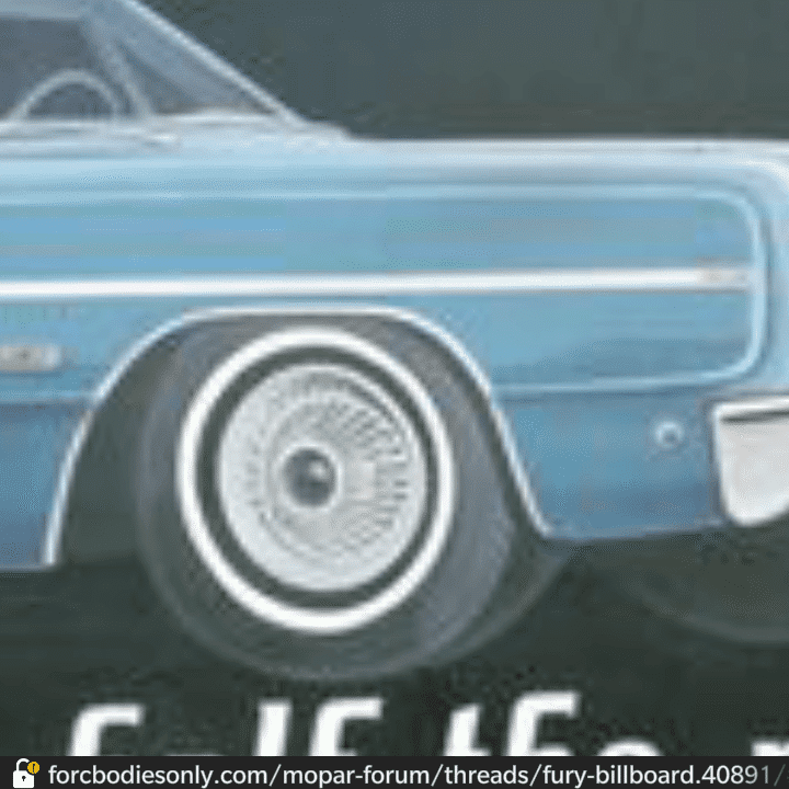
Sorry, it's just that I hate fakes passed off as real history. You guys have to get good at it or you'll start believing Time magazine covers.
Mike66Chryslers
Senior Member
I've seen pics of those billboards online before. I'm going to side with the theory that they were commissioned by a group of local dealers. I'd say they were trying to attract people with champagne taste on a beer budget by pointing out that the Fury looks a lot like a Lincoln Continental, at least in side profile, but much cheaper.
They didn't capitalize the C in continental on purpose... Lincoln's lawyers would have been all over them to change it. As is, they could argue that they weren't referring to the Lincoln Continental but cars from continental Europe. After all, that was the inspiration for the naming of the Lincoln Continental.
All just conjecture of course.
Carmine
Old Man with a Hat
All fakes. The VW ads didn't even do a good job blending the white backgrounds between the blank template and the magazine ad.
commando1
Old Man with a Hat
Last edited:
- Joined
- Nov 14, 2010
- Messages
- 27,947
- Reaction score
- 26,890
I don’t know about the Second one but the top one looks legit.
MrMoparCHP
Old Man with a Hat
On the first one you can see the panel lines on the billboard, not something most people would fake. Also at this time most billboards were still being painted in place, simpler the better.
Alan
Alan
Carmine
Old Man with a Hat
On the first one you can see the panel lines on the billboard, not something most people would fake. Also at this time most billboards were still being painted in place, simpler the better.
Alan
Modern photoshop (not the crummy MSPaint that Stan and I use) makes preserving details like individual panel lines very easy.
BTW, that Plymouth logo font is called "King Richard" and is fully compatible with all MS programs. I could write the Constitution with it. But I've never seen it used as copy in ads of that time.
Similar threads
- Replies
- 1
- Views
- 580
- Replies
- 14
- Views
- 1K
- Replies
- 6
- Views
- 711
